Give your questions the colors they deserve
We’ve just added a small but powerful new feature that gives you more control on how you visualize data on your map.
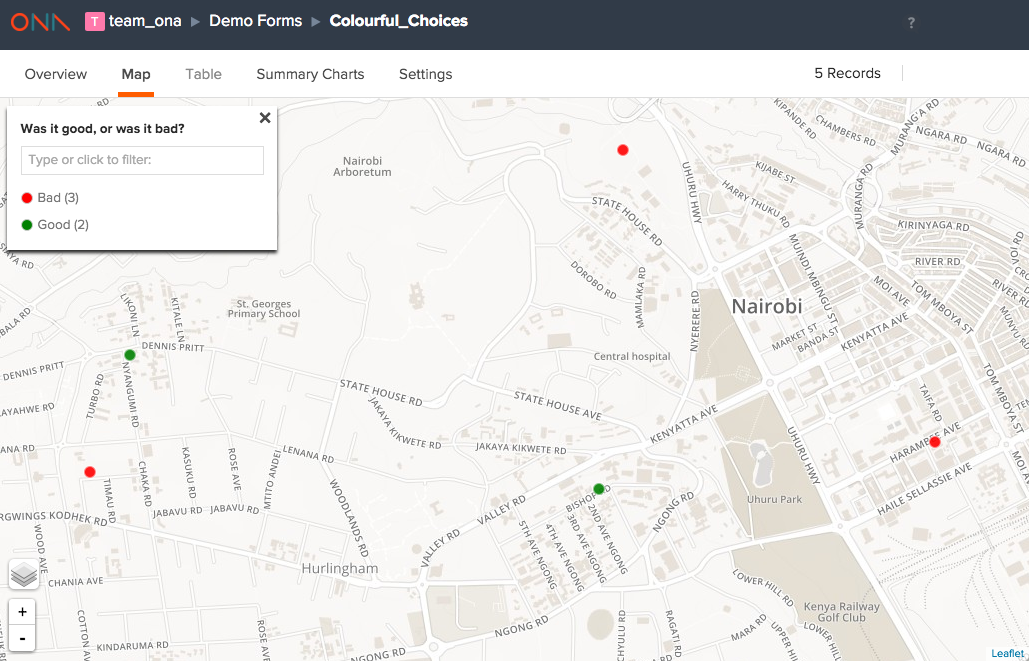
One of the challenges with our maps to date is you could not specify the colors for specific responses to data. Since colors are randomly assigned, it’s very possible to have true show up as red and false as green on a map. Confusing, we know!
To address this, we’ve made it possible to assign colors to specific categories (options) on the choices sheet in XLSForms.
Why do this in XLSForms? We will consider a UI approach in the future. However, we have seen firsthand how XLSForms have helped organizations standardize the way they author forms to collect data. By expanding XLSforms to support basic visualization logic – we can help ensure the data is interpreted in the way the author for the form intended.
How does it work?
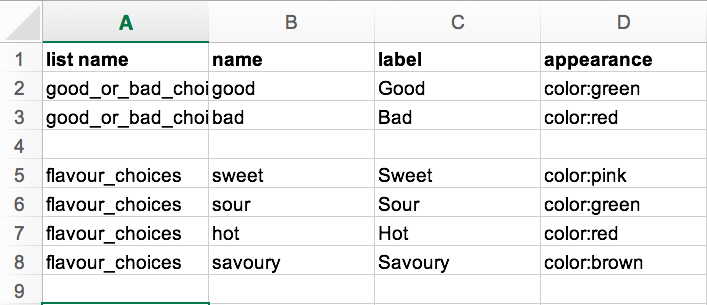
Right now you simply add the colors you want in the “appearance” column. To allow us to support modification of other visualization properties in the future, we use a format similar to CSS, a language typically used to style web pages. You can, therefore, specify a color in the appearance column as, for instance, color: red.
Note: You can use any standard web color, such as red, yellow, green or orange. You can also use hex codes, which gives you a wider selection to choose from. The website clrs.cc provides a nice palette of hex alternatives to the default colors that you can choose from.
The example form used in this demo can be found here.
Happy mapping!